Performance and Accessibility Review of the Joe Sestak for President Campaign Website

This is one in a series of posts that will look at the performance and #a11y metrics of the websites for the currently declared 2020 Democratic presidential candidates. Yeah, all of them! For more background on what I’m doing and how I’m doing it check read this.

Homepage of joesestak.com

joesestak.com

Dude, you announced after the first debates were set, after Rep. Jim Clyburn’s World Famous Fish Fry. Why? WHY?! You’re already toast. White, white toast. But I’ll do this review anyhow.

Google Lighthouse

Lighthouse scores of joesestak.com

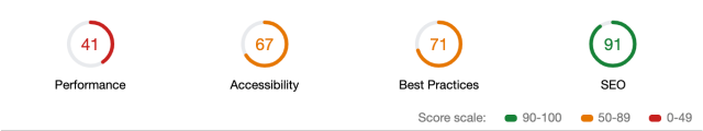
Performance: 41 out of 100

/wp-content/themes/joesestak/img/logo-slogan11.svg is a 538 KB svg. Five hundred kilobytes, for an svg. Because it has a drop shadow on an IMAGE of text. That makes me so irrationally upset I’m just going to move to the next section.

Accessibility: 67 out of 100

  • [id] attributes on the page are not unique.
  • Images missing alt attributes.
  • Browser default focus outlines are present, improving navigation via keyboard.
  • Links that only use an image with no discernible text content.

Best Practices: 71 out of 100

Scroll listeners are detrimental to the page performance.

SEO: 91 out of 100

A FIRST! WOW! Something new after 25 reviews. They are blocking Google and all search engines from indexing the site. Really though, who needs your site to show up in a simple Google search of your name when you’re running for president? Honestly, I’m shocked that Lighthouse gives such a blunder a 91.

<meta name="robots" content="noindex,follow" />

Network

  • HTTPS: yes
  • 156 Requests
  • 18.3 MB resources
  • Largest asset is a video that doesn’t appear until later in the page. Please clap.

Platform

  • WordPress, custom theme.

Notes

Being last to declare (so far) didn’t gain him any better a website than the other candidates. How long until someone discovers they’re getting zero traffic from search engines?

Performance and Accessibility Review of the Marianne Williamson 2020 Campaign Website

This is one in a series of posts that will look at the performance and #a11y metrics of the websites for the currently declared 2020 Democratic presidential candidates. Yeah, all of them! For more background on what I’m doing and how I’m doing it check read this.

Homepage of marianne2020.com

marianne2020.com

The timing.js console log statements in devtools quickly tipped me off that Seth’s site is running the on the same platform as another I’ve already reviewed. Nice, that saves me some writing.

Google Lighthouse

Lighthouse scores for marianne2020.com

Performance: 46 out of 100

11.8 seconds Time to Interactive.

Huge 2+ MB homepage image is loaded as in png format despite any need for that. 20 seconds are spent downloading images, sometimes the same image in multiple resolutions.

Accessibility: 63 out of 100

  • [id] attributes on the page are not unique.
  • Images missing alt attributes.
  • Browser default focus outlines are present, improving navigation via keyboard.
  • Links that only use an image with no discernible text content.

Best Practices: 64 out of 100

Lo-Dash@2.4.1 contains vulnerabilities.

Errors are being logged to the console:

timing.js:38 Timer 'Form' already exists
timing.js:38 Timer 'Downloading' already exists
at.js:26 Uncaught NVTag was already initialized. The NVTag JS is likely included more than once on this page.

SEO: 97 out of 100

Tap targets are not sized appropriately.

Network

  • HTTPS: yes
  • 109 Requests
  • 10 MB resources
  • Largest asset is the 2.2 MB hero png. A prime candidate for using webp, supported in 3 of the 4 major browsers.

Platform

  • Drupal, custom theme.

Notes

Not the best site of all the candidates, but not the worst by any means either. Properly optimizing image delivery would be a huge boost to the site’s performance.

Performance and Accessibility Review of the Mike Gravel 2020 Website

This is one in a series of posts that will look at the performance and #a11y metrics of the websites for the currently declared 2020 Democratic presidential candidates. Yeah, all of them! For more background on what I’m doing and how I’m doing it check read this.

Homepage for mikegravel.org

mikegravel.org

Really, no one can be sure Mike Gravel isn’t a made up fiction. That he isn’t just two teens in a trench coat, or a Corgi wearing sunglasses. I refuse to seriously consider that he’s an 89 year old anti-war former (as in 1981) US Senator running for president.

Google Lighthouse

Lighthouse scores for mikegravel.org

Performance: 86 out of 100

Deploy this as a static site and you’d score 100s across all categories. The same performance hits that impact the other twenty. two. candidates I’ve reviewed so far impact this WordPress landing page.

There is either no or very short cache lifetimes on all the assets. Setting these to longer durations would improve the performance metrics for subsequent visits to the site. Of which there might be dozens!

Accessibility: 66 out of 100

  • Interactive elements don’t have any visible :focus styling.
  • Form inputs have no associated labels.
  • <html> element must have a lang attribute
  • User scaling is disabled. Think of the 89 year old’s eyes! Or mine!

Best Practices: 86 out of 100

The links to cross-origin destinations are unsafe. Witnessed this in every single site reviewed.

SEO: 100 out of 100

No outstanding issues.

Network

  • HTTPS: yes
  • 48 Requests
  • 3.9 MB resources
  • Largest assets are related to the youtube player embed, 375 KB javascript. No big issue with this since it is efficiently served from Google’s content delivery network.

Platform

  • WordPress, custom theme.

Notes

Nah. I’m still not convince this isn’t a prank by the web designers with their “combined 25 years of experience.”

Performance and Accessibility Review of the Wayne Messam for America Website

This is one in a series of posts that will look at the performance and #a11y metrics of the websites for the currently declared 2020 Democratic presidential candidates. Yeah, all of them! For more background on what I’m doing and how I’m doing it check read this.

Homepage for wayneforusa.com

wayneforusa.com

Google Lighthouse

Lighthouse scores for wayneforusa.com

Performance: 57 out of 100

There are a bunch of render blocking CSS files in the head of the document, but they are minified and cached, so that’s a performance win.

There isn’t much interaction or scripting being executed so the Time to Interactive is 6+ seconds. Not great by any means but compared to the competition it’s quite lean.

Accessibility: 82 out of 100

  • Default :focus outlines on interactive elements.
  • Low contrast issues with text.
  • Social links don’t have any link text. Over and over I’ve seen this and it is such an easy fix.

Best Practices: 57 out of 100

24 requests are not served via HTTP/2.

Scrolling event listeners are not passive.

The links to cross-origin destinations are unsafe. Witnessed this in every single site reviewed.

SEO: 83 out of 100

His homepage wasn’t in the top 3 pages of results for my first “Wayne Messam” Google search so I wasn’t expecting great things here. Maybe I’m the first website to link back to him? At least waynemessam.com redirected appropriately.

The Google Tag Manager script is 404’d, that’s probably not a good sign.

Network

  • HTTPS: yes
  • 33 Requests
  • 2.3 MB resources
  • Largest asset is a 184 KB icon font. Yet I count only 6 icons in use across the entire site. This is a significant waste of space and the font could be subset or dropped in favor of a few svg files.

Platform

Notes

The site is so basic and yet performs so poorly across all categories. There is a contact form in the footer that is fixed in place and revealed on scroll, yet no consideration was given to reserve enough space so that elements weren’t cut off.

Contact form bug

Performance and Accessibility Review of the Seth Moulton 2020 Campaign Website

This is one in a series of posts that will look at the performance and #a11y metrics of the websites for the currently declared 2020 Democratic presidential candidates. Yeah, all of them! For more background on what I’m doing and how I’m doing it check read this.

Homepage of sethmoulton.com

sethmoulton.com

The timing.js console log statements in devtools quickly tipped me off that Seth’s site is running the on the same platform as another I’ve already reviewed. Nice, that saves me some writing.

Google Lighthouse

Lighthouse scores for sethmoulton.com

Performance: 42 out of 100

15 seconds Time to interactive is 4 seconds worse than the same platform running Tulsi Gabbard’s site, yet he gets 2 more points in this performance score.

Despite the many images loaded, a spot check of the largest among them at least shows that they’ve been run through a lossless image optimizer.

Accessibility: 62 out of 100

  • The gravity forms plugin in use on the site adds tabindex values greater than 0. Generally there is no reason to do this, defining an order different than what it would normally be just based on the source order of elements.
  • There is no visual indicator that any of the interactive elements (save for Twitter’s embedded tweets) are focused.
  • Credit where credit is due, although it is visually inaccessible and doesn’t display a focus state, the Issues accordion found in the middle of the page actually does respond to keyboard clicks.
  • 17 empty links with no discernible text.

Best Practices: 79 out of 100

Lo-Dash@2.4.1 contains vulnerabilities.

timing.js is logging errors to the console:

timing.js:38 Timer 'Form' does not exist
timing.js:38 Timer 'Downloading' does not exist

SEO: 92 out of 100

1 link without descriptive text, simply “here”.

Network

  • HTTPS: yes
  • 163 Requests
  • 7.9 MB resources
  • Largest asset is the 1 MB banner jpg. A prime candidate for using webp, supported in 3 of the 4 major browsers.

Platform

  • Drupal, custom theme.

Notes

It looks like he hired a Massachusetts shop to design and dev the site, so props for supporting his local economy.